Custom Storyblok Field Type: Input with a Unit
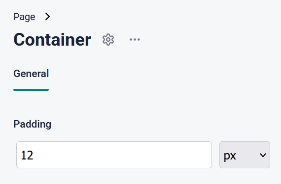
Composable component architectures contain a number of categories of components. For many projects, implementing strictly components will create content development efficiencies by restricting design choice. For other sites, it can be useful to grant content editors the ability to affect the underlying styles (read: CSS) of components. As you find yourself implementing spacing and sizing fields, you may want the option to select the unit of measurement. Enter the "Input with Unit" field type!
This post uses the Storyblok React Field Type SDK. For more information, see https://www.storyblok.com/docs/plugins/field-plugins/
The first thing we define is the model that will contain the data our plugin manages and displays. To simplify downstream use, we will use both separate value and unit properties, as well as a combined property that represents a valid CSS size value (e.g. "12px").
export interface ContentModel {
  value?: string;
  valueRaw?: string;
  unit: string;
  [key: string]: any;
}
Our field type component defines the following DOM, containing an input field to capture the value and a select input to capture the unit. Note that we are updating the valueRaw property on the model, so that the value property can contain our valid CSS string.
<div className="input-with-unit--wrapper">
  <div className="form-group">
    <div className="input-group">
      <div>
        <input
          type="text"
          value={model.valueRaw}
          onChange={(e) => updateModel("valueRaw", e.target.value)}
          placeholder="auto"
        />
      </div>
    </div>
    <select onChange={(e) => updateModel("unit", e.target.value as string)}>
      {units.map((unit) => (
        <option key={unit} value={unit} selected={model.unit === unit}>
          {unit}
        </option>
      ))}
    </select>
  </div>
</div>
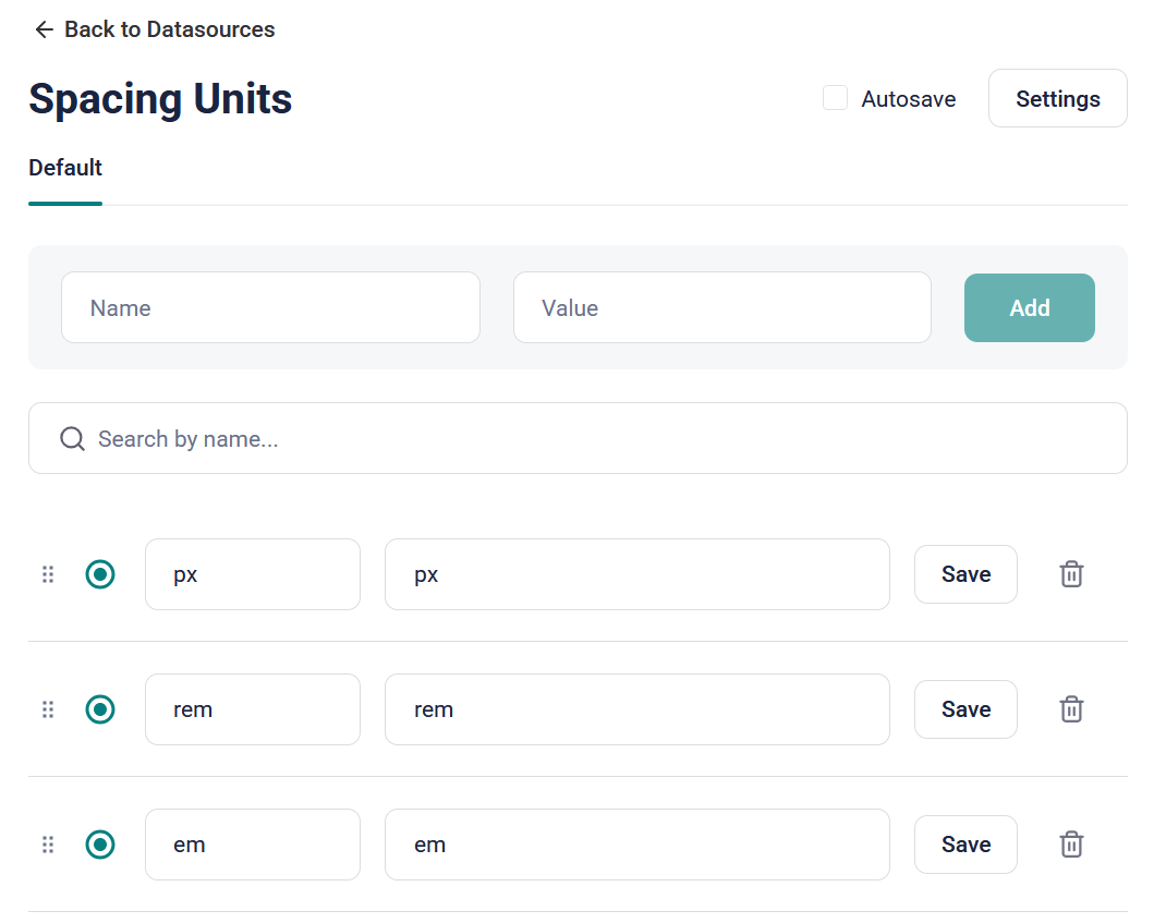
To support this DOM, we need some units to render. These can come as a data source in the options (selected via the Storyblok UI) or from an array of defaults.
// default unit options
const DefaultUnitOptions = ["px", "em", "rem", "%", "vw", "vh"];

// grab the unit options if they are provided
let units = DefaultUnitOptions;
if (data?.options) {
  const optionsKeys = Object.keys(data.options);

  if (optionsKeys && optionsKeys.length > 0) {
    units = optionsKeys;
  }
}
With custom field types, the data we're dealing with actually comes by way of objects passed via the useFieldPlugin hook. We'll consume that data and add it to a set of defaults to form the model we render. As we make changes via the hook, this model object will be updated automatically.
// build the default model
const DefaultModel: ContentModel = {
  valueRaw: "",
  unit: units.length > 0 ? units[0] : "",
};

// build the model for display, combining default and provided data
const model = { ...DefaultModel, ...(data.content as ContentModel) };
Lastly, we'll update the model via a single callback method. When the unit changes, we need to update the "compiled" CSS value. But we'll need to do that when the raw value changes as well, so it's easier to reduce repetition and make a single method to handle both scenarios.
// updates the model based on callbacks from the ui
const updateModel = (prop: "valueRaw" | "unit", val: string) => {
  // setup the new model
  const newModel: ContentModel = {
    ...model,
    unit: prop === "unit" ? val : model.unit ?? units[0],
  };

  // if we're only changing a single value
  // load the prop right in
  if (prop !== "unit") {
    if (!isValidNumber(val)) {
      return;
    }

    newModel[prop] = val;
  }

  newModel.value =
    newModel.valueRaw && newModel.valueRaw.length > 0
      ? `${newModel.valueRaw}${newModel.unit}`
      : undefined;

  // pass the data back up into the hook
  actions.setContent(newModel);
};
TIP
When the supplied value is empty, we set the model to undefined, so that downstream use of the field's data has a valid CSS property. In these cases, we do not want an empty string to be rendered into a style (e.g. "width:;")
Lastly, we'll style our field type to closely match the official field styles. Unfortunately, at the time of this writing, Storyblok does not provide a valid mechanism for styling custom fields in the correct way. For now, we'll add custom styles to position and style our fields.
.input-with-unit--wrapper * {
  box-sizing: border-box !important;
}

.form-group {
  margin-bottom: 10px;
  display: flex;
  gap: 10px;
  padding: 4px;
}

.form-group select {
  width: 100%;
  padding: 8px 5px;
  border-radius: 4px;
  border: solid 1px #ccc;
  flex: 0 1 25%;
}

.input-group {
  max-width: 100%;
  width: 100%;
}

.input-group > div {
  width: 100%;
}

.input-group > div > input {
  width: 100%;
  padding: 8px 5px;
  border-radius: 4px;
  border: solid 1px #ccc;
}

.input-group > div > input:focus {
  outline-width: 2px;
  outline-offset: 2px;
  outline-color: var(--sb_green) !important;
}
After deploying via npm run deploy, we are able to see our plugin. If you supply a datasource, the keys will be selected to represent the units in the dropdown. You can change the code to load the values of the properties if you'd rather add friendly display names as keys.
To view the full and up-to-date source code, please visit github.com/jsedlak/storyblok-input-with-unit